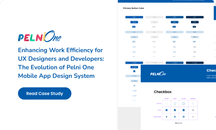
Project Overview
Pelni one mobile is an internal HR application at Pelni with various features such as employee absences, leave permission, pay slips, and others.
When I was working on this project, I was asked to redesign the entire page because I wanted additional features and some other changes.
Challenge
While working on it there are several components, text, and colors that are inconsistent and messy so they have to be neatly arranged so that they have an application style guide when they want to hand off them to other developers or designers.
What are the first steps that I need to do?
The Problem
Before embarking on designing the design system, it was essential to understand the challenges and opportunities present in the current design. After discussing, finally found out some of the problems that exist in the Pelni One mobile app
1. The display is still inconsistent and the interface and experience are less comfortable for users after conducting internal discussions with the IT team
2. The addition of several features such as leave permits, information, conferences, KPI performance, and e-travel reimbursement
3. Components that use groups so that when developed for engineers it's a mess and doesn't match one component and another
Discussions with the Lead and Internal Team
After knowing the problems that exist and adding any features you want. Then conducting discussions is necessary before proceeding to the next stage in order to simplify and clarify what things are important and necessary for the system design that will be used later.
Brainstorming Session
We collaboratively engaged in a productive brainstorming session to generate ideas and establish an outline encompassing the fundamental components, styles, and guidelines essential for integration into the forthcoming design system.
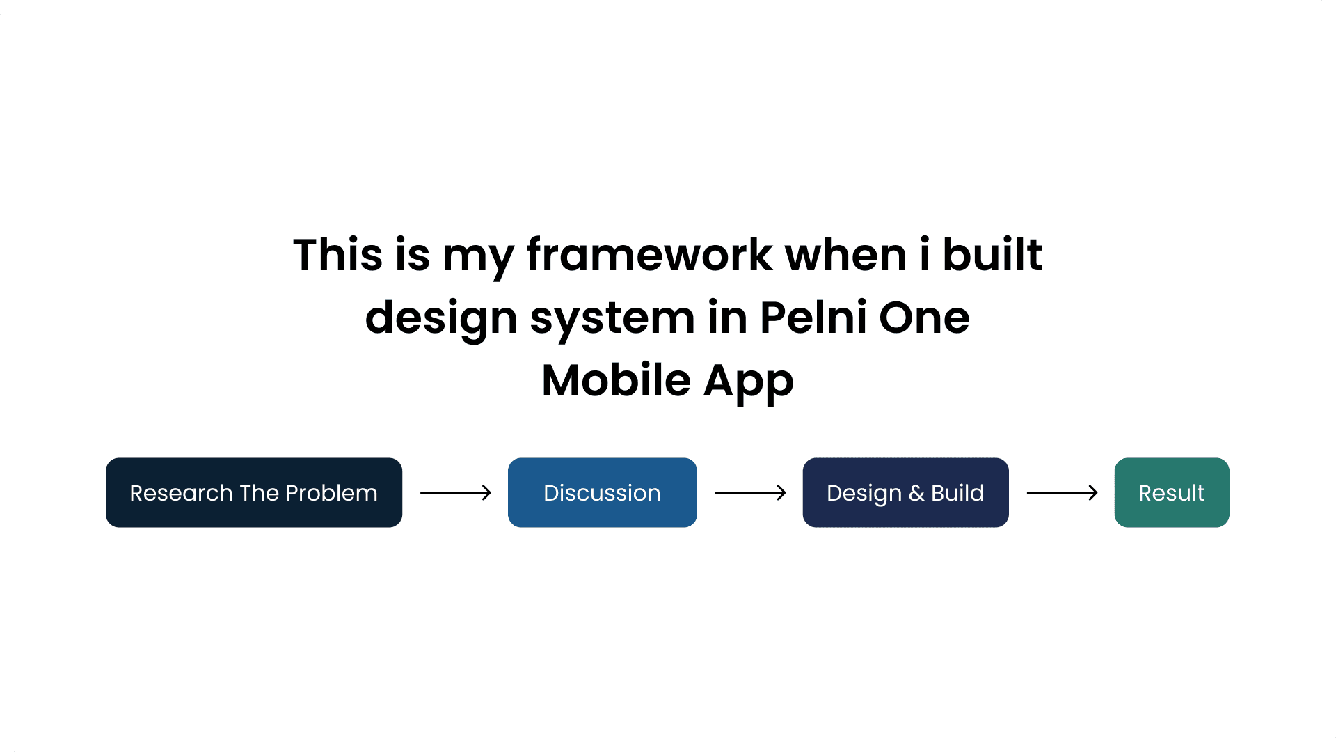
The Process Design and Build
Based on the insights gathered, creating a design system begins with tidying up the style guide
Style Guide
Typography
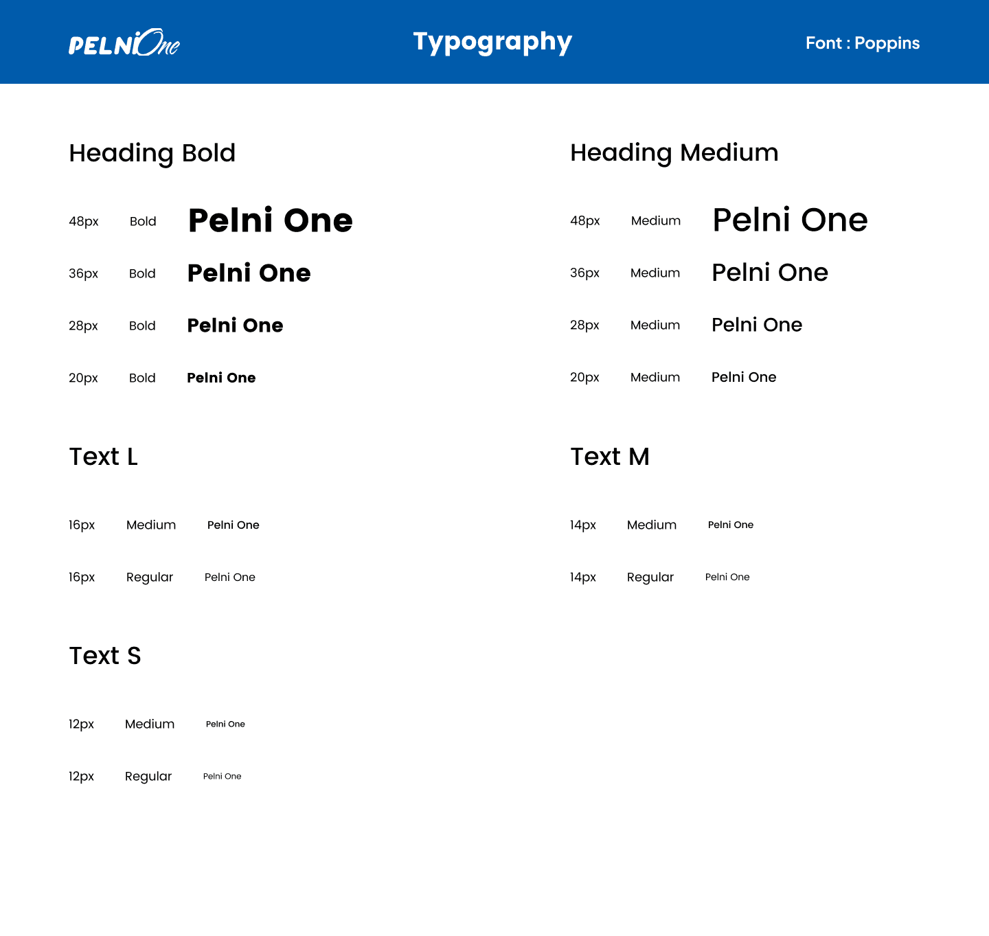
the font used is unchanged from before, namely Poppins. but because the previous size was different for each heading, subheading, and paragraph, I made it and put it in the typography style guide
Colors
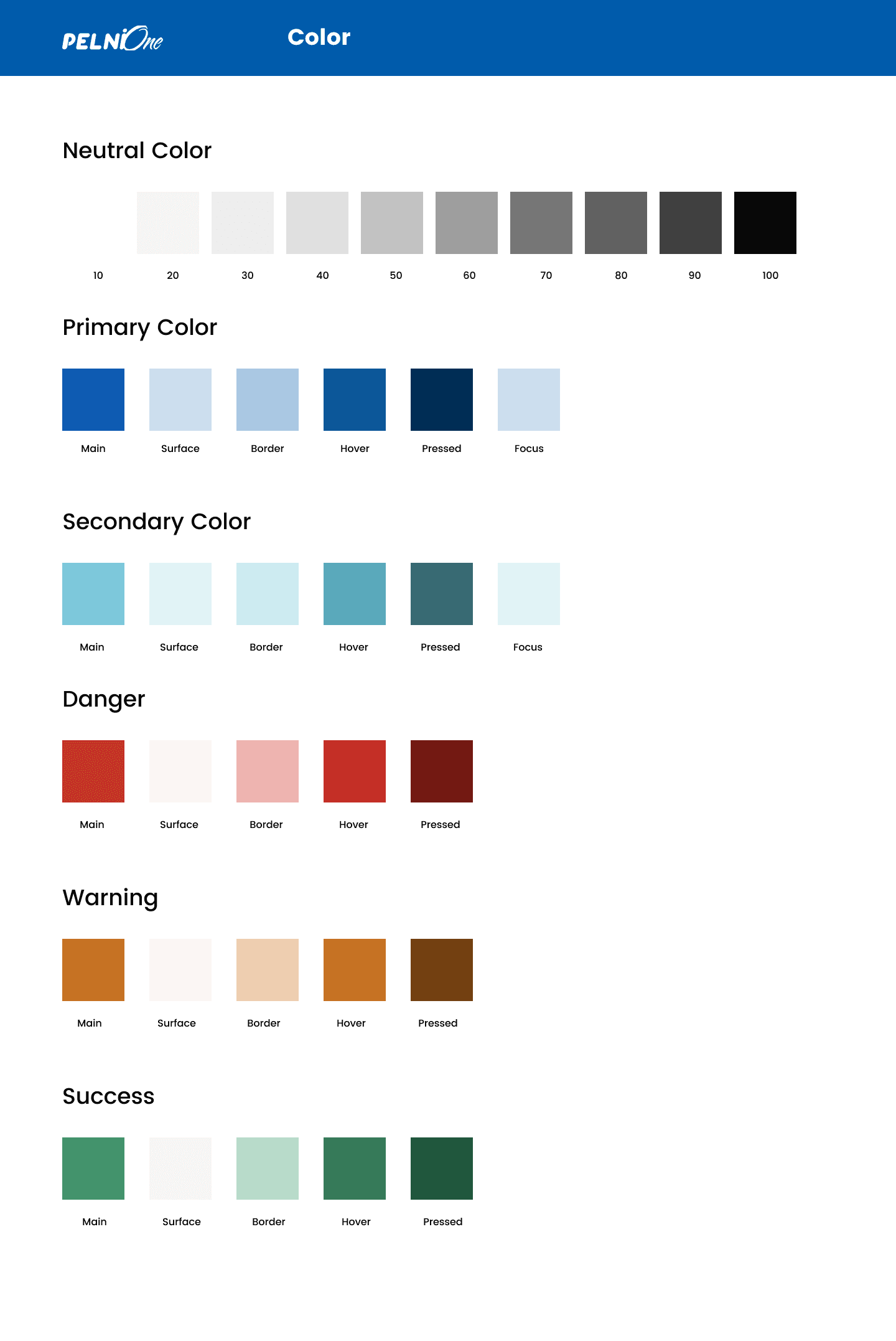
Regarding the color itself, I incorporate various derivatives or types including hover, pressed, surface, border, and focus to cater to specific conditions. In addition, I have integrated multiple colors to signify success, warning, and danger categories.
Shadow
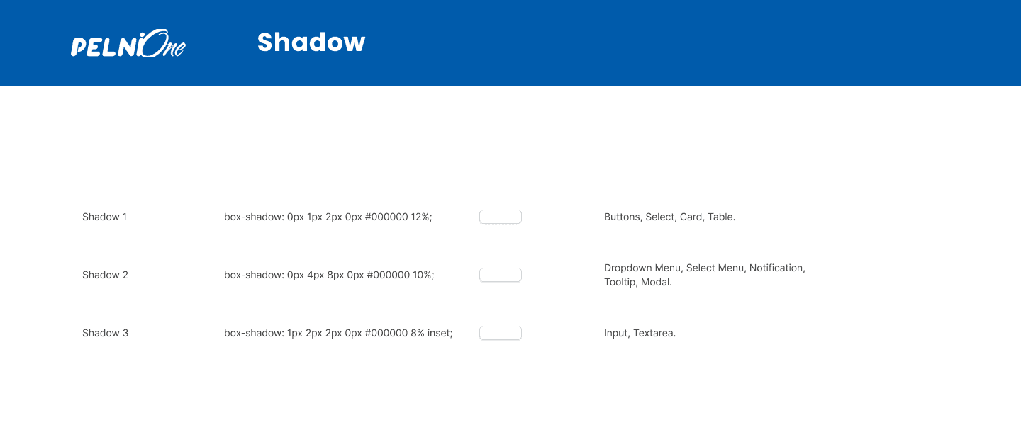
Shadows are used to give the illusion of depth and help create a more realistic and engaging visual representation of digital elements.
Grid & Spacing
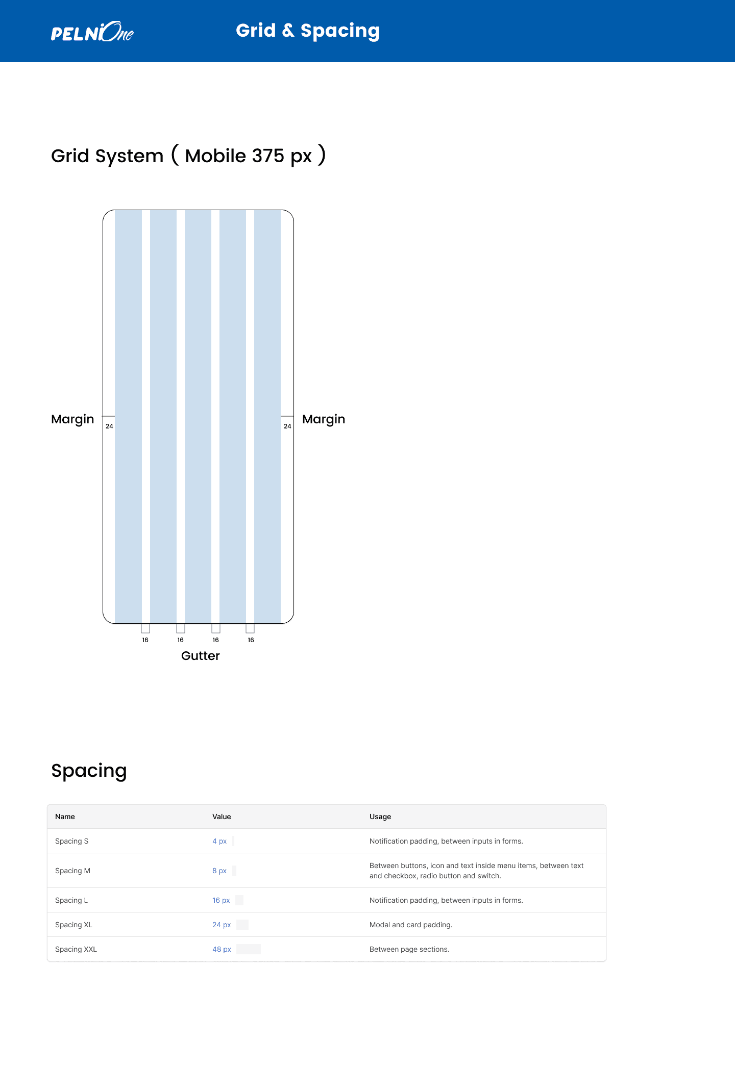
Grids are used to ensure that design elements are consistently aligned and spaced, which enhances the visual harmony of the interface.
Spacing refers to the intentional arrangement of white space (blank areas) between design elements. Proper spacing, also known as padding and margins, plays an important role in improving readability, guiding user focus, and preventing clutter.
Icon Guidelines
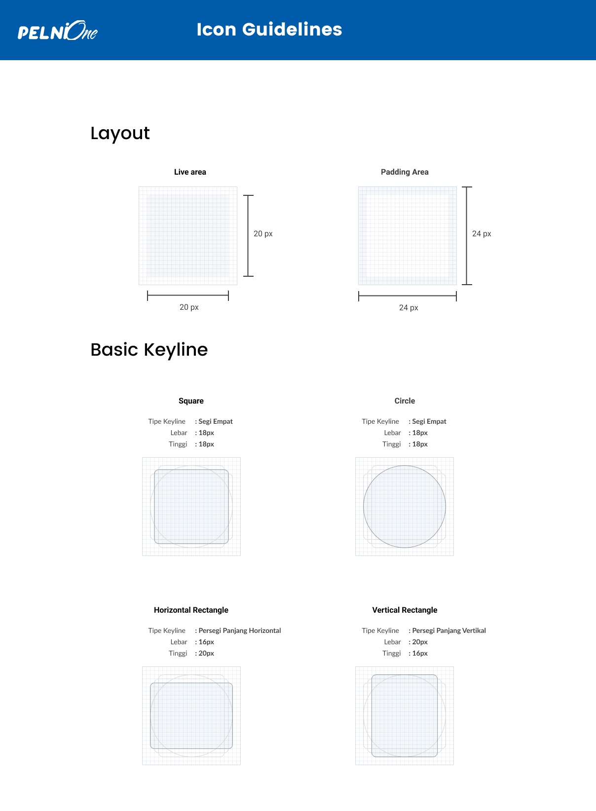
Icon guidelines ensure uniformity and adherence to established criteria when designing custom icons, promoting consistency and alignment with the predefined standards and this is a sneak peek at the icon I built.
Component
Tags & Text Area
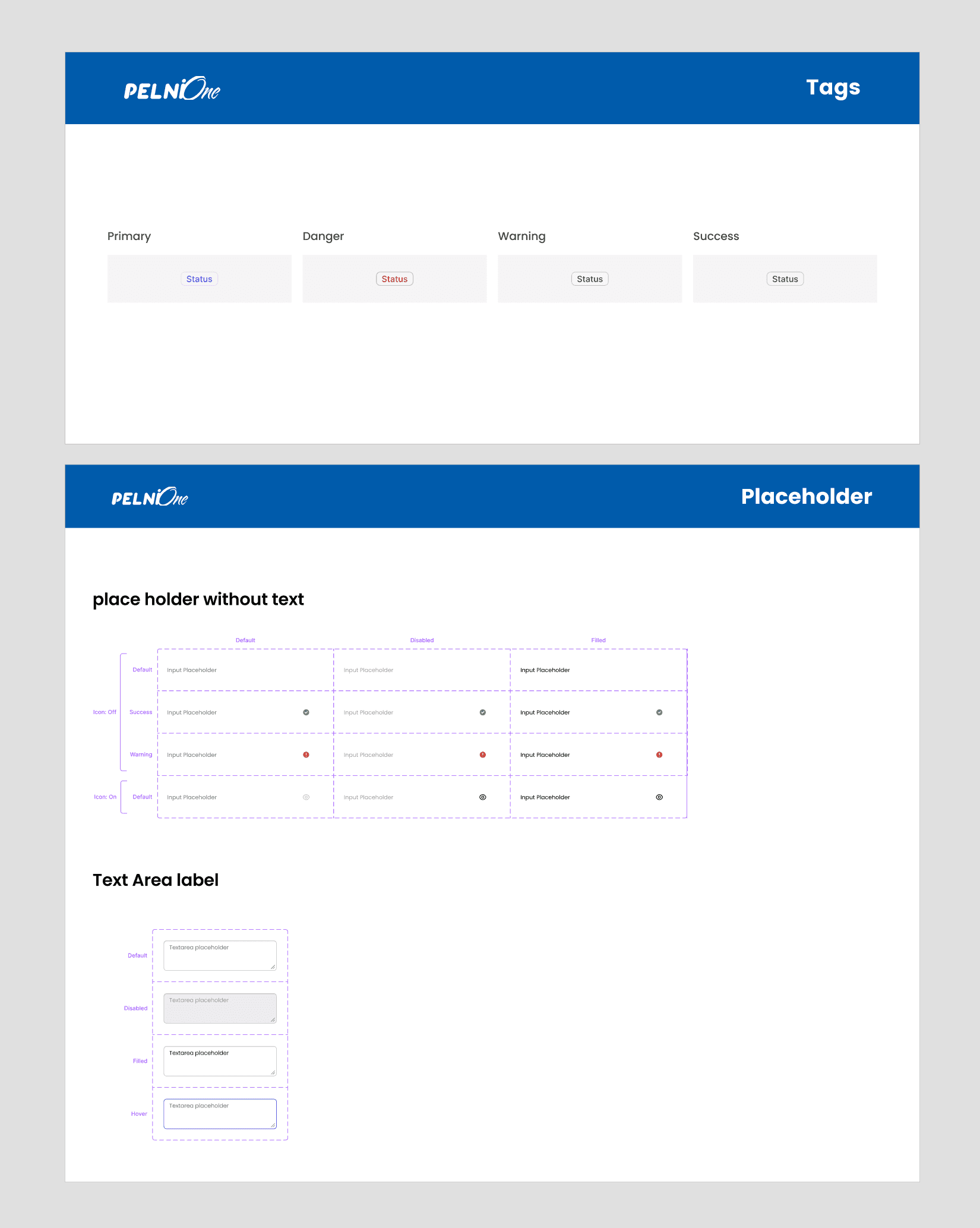
Tags can be used to indicate a component's state, such as "new", "updated", "dangerous", "warning" or "success". These indicators help designers and developers quickly identify which components are currently in use, which are outdated, or which require special attention.
Text Area and Placeholder functions for Keeping the placeholder text concise and clear, conveying the purpose of the text area. Ensure the placeholder text provides relevant guidance or context to users
Checkbox, Radio Button And Color Checker
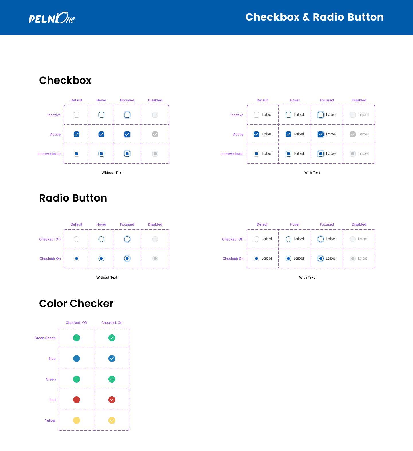
A checkbox is a user interface element/component that allows users to select or deselect an option from a list of choices. I made it with two conditions, namely when using text and when not using text
Radio buttons are used when users need to make a single choice from a set of options. Unlike checkboxes, where multiple selections are possible, radio buttons allow only one selection
The color checker functions to indicate the type of letter when incoming mail is in the Pelni One mobile app
Button
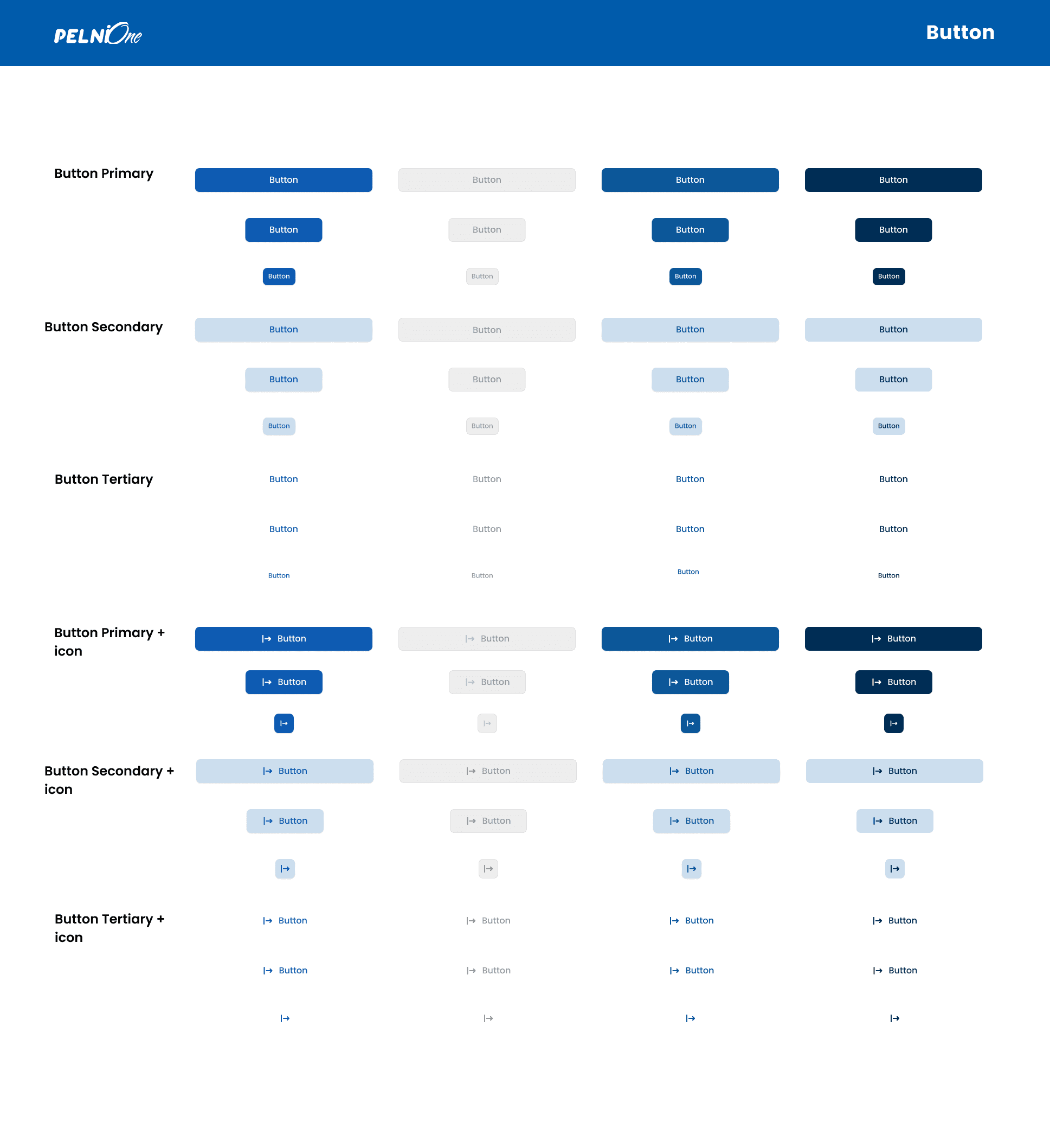
Button" is one of the most common types of function components in UI/UX design. It is a visual element that the user can click or tap to trigger a certain action. I created it with multiple conditions with sizes from small, medium , and large then with state primary, secondary, and tertiary as well as buttons that use icons and those that don't use them
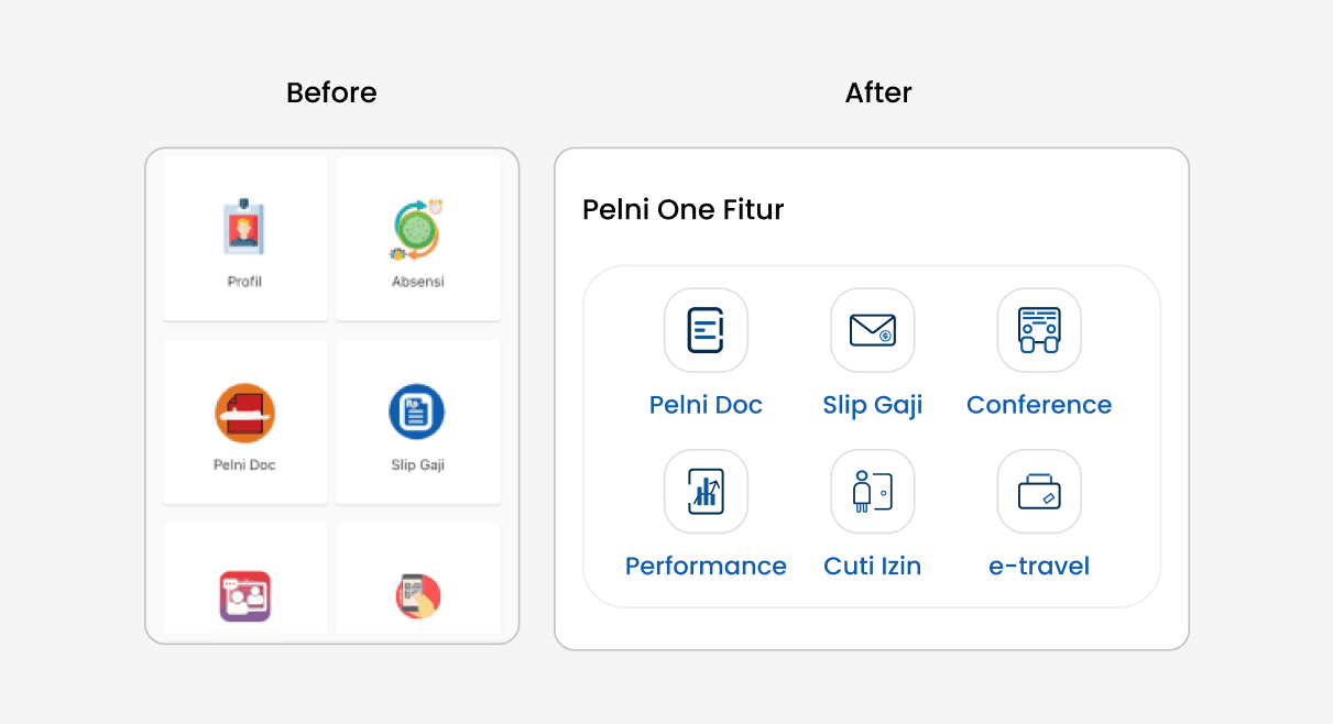
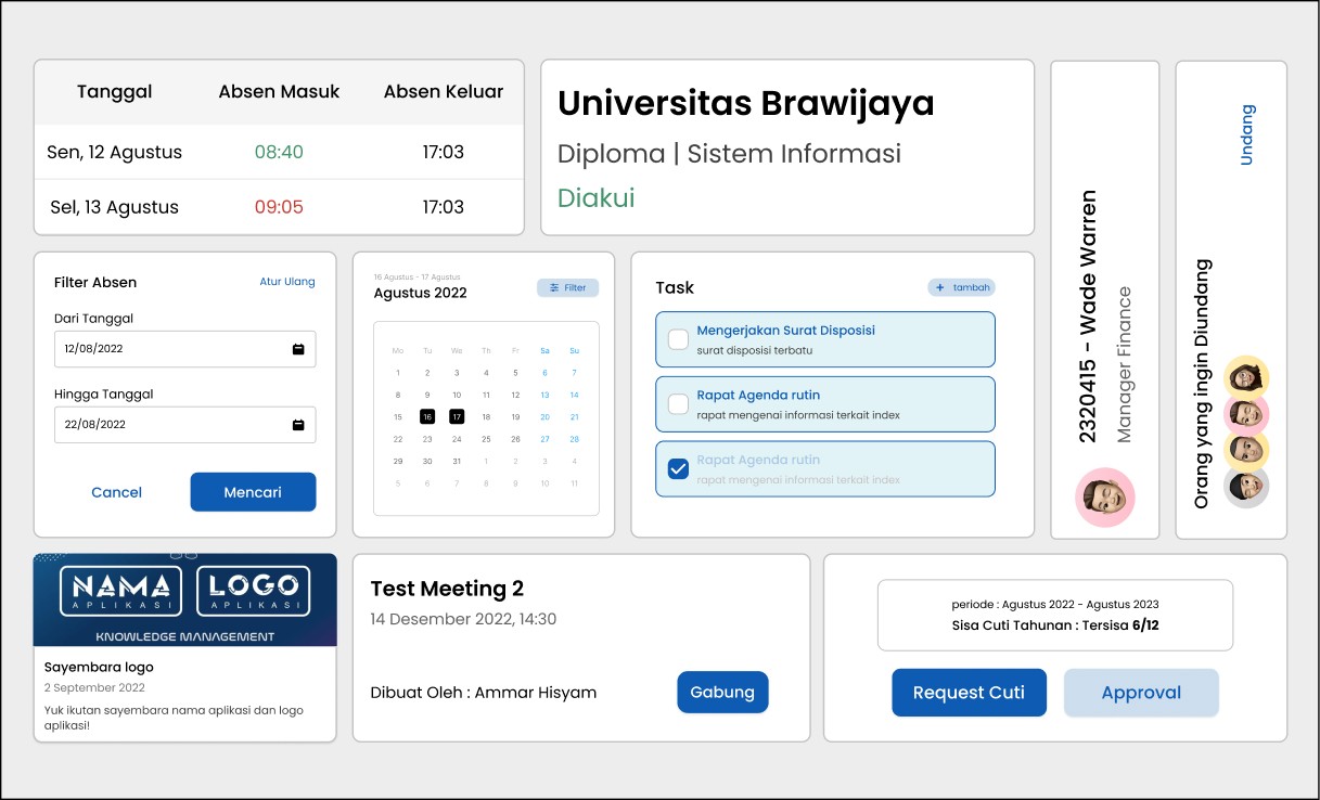
Implementation
The subsequent list comprises components of the Pelni One application that have been developed based on the system design.
Conclusion
By considering the components of a design, guidelines, and a collaborative process among each other, a design system is created to optimize the work of a developer and designer while working and reduce the previously required time.
Furthermore, there are many things I learned while creating the Pelni One Mobile design system, as it's not as easy as imagined and is still far from perfect, as it's still in the process of understanding various design systems of published applications and websites of companies. Therefore, the hope is that this design system can continue to be updated and refreshed in a more comprehensive and organized manner.